Am I right?
Stone stockpiles are too boring so ?I'll leave it for tomorrow.
A quick history lesson: in the beginning, when DwarvesH had just a few lines of code and was top down, I was using a GUI with U++ controls, which since I was compiling on Windows had Windows look & feel. As complexity and map sizes increased, I had to abandon "native" bliting and turned to Irrlicht for hardware acceleration. I couldn't get the Irrlicht and U++ event loop to play nice together and Irrlicht refused to go fullscreen if it was running in a host window, so this lead to the separation of the game from the editor into two different executables. The game was using Irrlicht widgets and the editor the far richer U++ widgets. But I grew tired of the Irrlicht GUI API. While I sincerely dislike Irrlicht API design, it is a very fine piece of software with indisputable advantages, so I thought that using the same API for GUI would not bother me that much. I was wrong. I quickly wrote a very hackish wrapper/bridge around Irrlicht GUI, having a U++ interface but using Irrlicht widgets behind the scenes. In time this solution turned out to be too much to maintain, so I replaced it with a very thin wrapper over Irrlicht, using both the widgets and the API style. Way to go around in circles, I know. So I started wrapping stuff to escape Irrlicht API design, and ended up with a wrapper system which was easy to maintain but had a similar API design.
Fast forward to a while ago, when I started correcting this mistake. I wrote a very light weight GUI system with U++ style API that was not using Irrlicht widgets but was using its drawing API. This solution was less than ideal, but with the emphasis I am putting on user interface, working with an API that I disliked would have certainly influenced your user experience in a negative way. The new GUI library is extremely lightweight, but also not very rich. This is not a problem, since my GUI uses simple widgets in complex ways, rather than using complex widgets.
The system has stood the test of time and right now it only has the following widgets: TopWindow, StaticRect, Button, Label and Option. For the rest, I am still using Irrlicht widgets, but they will be phased out.
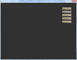
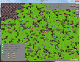
What is the purpose of this post? To tell that the above mentioned custom 5 widgets have fully replaced their Irrlicht wrapper counterparts. I even deleted the wrapper classes. Button has a new default skin, which probably won't be the final skin used in the game, and the rest of widgets will get skined soon.
I leave you with a gallery of screenshots showing the new GUI. Keep in mind that I did not touch some of the windows in quite a while and their content is outdated. The menus used to set up a new world and expedition are particularly out of date since I did not work on them since my first video presentation.
See if you can tell Irrlicht and custom widgets apart!


I realize this is just an alpha state, but I have some suggestions:
ReplyDeleteNot a fan of the "just bigger than the text" buttons. The thin black font on the small buttons make them hard to distinguish. Things like the Pause button look great. There's plenty of whitespace to give the reader an easy time reading the letters but the smaller buttons just don't look right at all. The +/- buttons are okay because they have ample whitespace around them (barely) but the top right buttons on screen I can't even tell what they are supposed to be. The first menu (main menu?) could use a bit of margin left/right of the text as well. Not a lot, but some.
Thanks for the feedback!
ReplyDeleteI think you are right. The first design I had for buttons is better in this regard and I like it more, but right now I am having troubles fitting it around large buttons. On small ones it works fine.
At least this design works reasonably well with any size buttons. But it will probably be temporary.